The first data visualization I published was in CERP (10.1039/C8RP00115D):
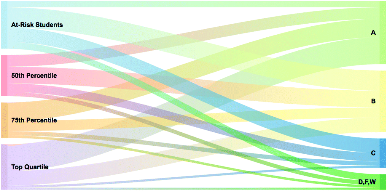
Most of us can identify when a visual doesn't work (for me, it's when it takes me more than 30 seconds to figure out what the visual is communicating), but few of us can explain why it doesn't work.
What I didn't know when I published this figure was:
- No sample sizes: Without numerical context, the readers are forced to estimate proportions visually.
- No interpretative legend: How will others determine what the flow width in this diagram represents?
- The similar green color tones may be difficult to distinguish, particularly for those with color vision differences.
Still, I've been asked numerous times how I arrived at this figure. Why? I think it's because there are few resources available for learning how to visualize data.
Unless you're department leaders have strong relationships with those in the Statistics Department, it's unlikely you'll receive specialized data visualization training as a student researcher.
My figure illustrates that even well-intentioned academic visualizations can benefit from applying fundamental data visualization principles.
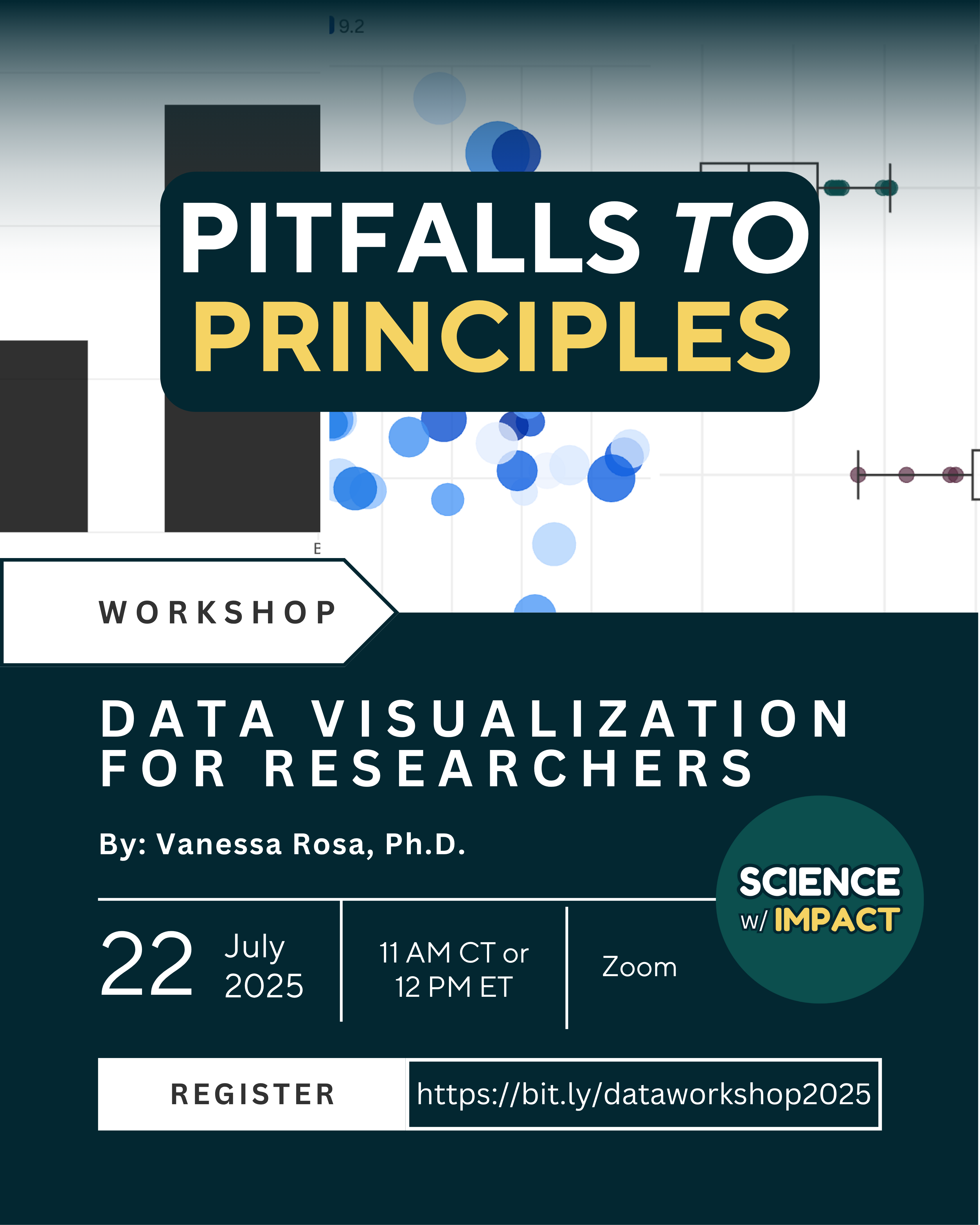
I've summarized the ones I use most in this PDF:
And decided to campaign for our VERY FIRST nonprofit grant to the undergraduate researchers at NSF's Center for Sustainable Nanotechnology.
Donate or share with your network today and help us develop collaborative improvement exercises that transform research students from hesitant to confident data storytellers:
Do you know an early-career researcher who would like to attend? Send this over!
We will record the session, share it broadly across our network, and use it to develop a concise, free course for early-career researchers to quickly hone in on the top 20% of concepts that can address 80% of the mistakes we see:
Click for fun (real) examples of terrible data visualizations.
Thank you for considering this. Have a beautiful day! We'll share an update about how this all worked out in an upcoming Friday Update 😄
Member discussion